Etro Paisley: What Makes It Truly Unique?
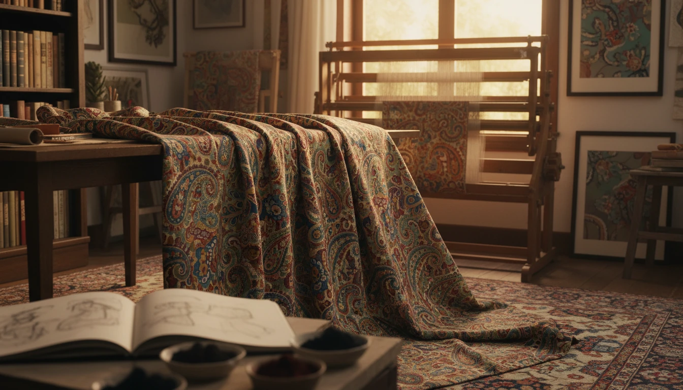
What makes Etro paisley unique?
Etro paisley stands out because it treats a centuries-old motif as a living design language rather than a fixed print. Instead of repeating a single teardrop shape, Etro builds richly layered compositions—mixing scrolling botanicals, micro-ornaments, and unexpected color pairings so the pattern feels dimensional and emotionally expressive, not flat or predictable.
A big part of its distinctiveness is how the house uses color. Classic paisley often leans on a limited palette, but Etro is known for complex, tapestry-like combinations—earthy tones offset by jewel hues, or warm bases punctuated with electric accents. The result is paisley that reads simultaneously vintage and modern, with movement that changes depending on distance and lighting.
Scale and placement also matter. Etro frequently plays with oversized motifs, dense all-over fields, and engineered layouts that follow seams and silhouettes. That approach makes the print feel intentional on the body or within a room, not simply “applied” on top of a product. You’ll notice how borders, directional swirls, and clustered medallions can guide the eye and create a sense of craftsmanship.
Finally, Etro paisley carries a recognizable cultural depth. The brand’s long-standing fascination with global textiles—especially Indian-inspired patterns and historical fabric traditions—shows up in the ornate detailing and collected, archive-like feel. For a deeper dive into the history, design cues, and how to spot defining details, visit the full guide on Etro paisley.
For Etro Paisley: What Makes It Truly Unique?, the best answer depends on fit, material, care instructions, and how the product will be used day to day.
Checking those details first helps avoid a poor match and keeps the choice practical after delivery.
For Etro Paisley: What Makes It Truly Unique?, the best answer depends on fit, material, care instructions, and how the product will be used day to day.
FAQ
How do you style Etro paisley without looking too busy?
Pair one paisley statement piece with solids pulled from the print’s quieter tones, and keep silhouettes clean. If mixing patterns, match color families and vary scale—small geometrics with larger paisley usually feels balanced.








Leave a comment