Quiet Luxury Interiors: Neutral Minimalism That Lasts
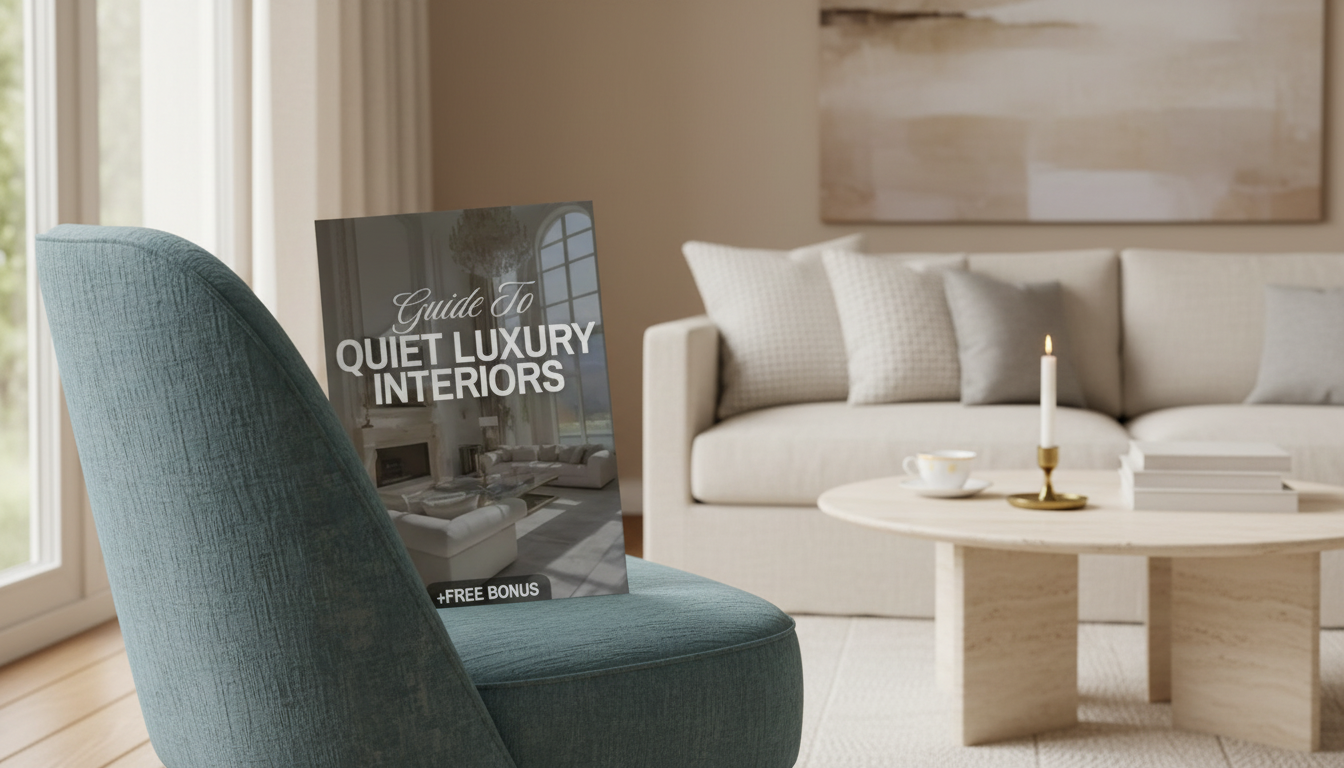
Quiet Luxury Interiors: Minimalist Design with a Neutral Palette and Timeless Style
Quiet luxury interiors blend restraint, craftsmanship, and comfort—spaces that feel elevated without looking showy. The approach pairs minimalist home design principles with a calm neutral palette, natural textures, and a few enduring statement pieces. The goal isn’t to make a room feel “done” with more decor; it’s to make it feel effortless through better proportions, better materials, and better editing.
To keep choices cohesive, it helps to lean on classic interior design fundamentals—proportion, balance, and emphasis—so every item supports the room’s overall calm. (A quick refresher on these principles is outlined by Encyclopaedia Britannica’s interior design overview.)
What “quiet luxury” looks like in a home
- Understated, not bare: fewer items, higher quality, and each piece earns its place.
- Visual calm: limited color range, controlled contrast, and generous negative space.
- Craft over logos: natural materials, tailored upholstery, solid joinery, and refined finishes.
- Comfort is part of luxury: soft acoustics, warm lighting, and tactile surfaces.
Start with the room’s architecture and layout
- Clarify the focal point: fireplace, window wall, artwork, or a single sculptural furniture piece.
- Improve flow: keep primary pathways open; avoid furniture that interrupts circulation.
- Create zones with placement rather than clutter: a rug, a console, or a pair of chairs can define areas.
- Edit visual noise at eye level: simplify shelves, align heights, and reduce competing silhouettes.
A practical checkpoint: stand at the main entry to the room and scan left to right. If your eye keeps “snagging” on sharp contrasts (busy shelves, many small frames, too many leg styles), edit until the focal point reads first and the rest supports it.
Build a neutral palette that still has depth
- Choose one dominant neutral (warm white, cream, greige, stone) for walls and large surfaces.
- Add two supporting tones: one mid-tone (taupe, sand, mushroom) and one deeper anchor (charcoal, espresso, deep olive).
- Mix finishes to avoid flatness: matte walls, satin trim, brushed metal, honed stone, and natural wood.
- Limit high-contrast moments to a few intentional accents (a black frame, a dark lamp base, a single art piece).
Neutral Palette Builder (quick combinations)
| Base | Mid-tone | Anchor | Best paired materials |
|---|---|---|---|
| Warm white | Sand | Espresso | Oak, linen, aged brass |
| Cream | Mushroom | Charcoal | Travertine, wool, blackened steel |
| Greige | Taupe | Deep olive | Walnut, bouclé, brushed nickel |
| Stone | Putty | Soft black | Limestone, leather, smoked glass |
For a truly timeless look, keep undertones consistent across rooms. If the paint reads warm, echo that warmth in woods and textiles; if it reads balanced, keep metals and stone finishes similarly neutral.
Texture is the “pattern” in quiet luxury
- Layer tactile neutrals: linen drapery, wool rugs, bouclé or brushed cotton upholstery.
- Balance smooth and nubby: pair stone or lacquer with woven baskets, raw wood, or plaster finishes.
- Use large-scale texture instead of busy prints: ribbed glass, slubbed fabric, wide-weave rugs.
- Keep patterns subtle and tonal: tone-on-tone stripes, herringbone, or micro-checks.
When in doubt, swap small, high-contrast prints for one quiet, tactile surface: a textured rug, a stone side table, or curtains with a soft, weighty drape.
Choose fewer, better furniture pieces
- Prioritize the “big three”: sofa, bed, and dining table—these define comfort and longevity.
- Look for timeless shapes: clean lines, gentle curves, and classic proportions rather than trendy silhouettes.
- Upgrade what’s touched daily: hardware, faucets, switches, drawer slides, and door handles.
- Aim for cohesion in leg styles and finishes (too many competing metals/woods can feel restless).
If you’re adding a single tabletop statement, choose one that looks refined even when the rest of the table is cleared. The Luxury Iridescent Shell Placemats – Handmade Nordic Round Decorative Tray can double as a sculptural catchall for a dining table, console, or coffee table—especially effective when surrounded by matte ceramics and natural wood.
Lighting that feels soft, warm, and intentional
- Use three layers: ambient (ceiling), task (reading/cooking), and accent (art/architecture).
- Choose warmer color temperatures for living spaces; keep brightness dimmable where possible.
- Match fixture scale to the room: oversized pendants can look luxurious when the rest is restrained.
- Highlight texture: grazing light on plaster walls, curtains, or stone adds depth without adding objects.
Light quality matters as much as style. A higher Color Rendering Index (CRI) helps neutrals look richer and more accurate—especially in creams, taupes, and woods. The U.S. Department of Energy provides a helpful primer on lighting quality and choices here.
Styling rules: restraint with one memorable moment
A practical checklist for finishing touches
A guided way to pull it all together
For a structured approach—from defining your palette to selecting finishes and creating a cohesive room plan—the Guide to Quiet Luxury Interiors | Minimalist Home Design eBook | Neutral Palette, Timeless Style & Interior Design Checklist provides a clear framework you can reuse room by room, so the final result feels intentional rather than piecemeal.
FAQ
How is quiet luxury different from minimalism?
Minimalism focuses on reducing items and simplifying forms, while quiet luxury emphasizes quality, comfort, and refined materials. Both value restraint, but quiet luxury typically includes richer textures and a few investment pieces that feel enduring.
What neutral colors work best for a timeless interior?
Start with a warm or balanced base (warm white, cream, greige, or stone), then add a mid-tone for softness and an anchor shade for depth. Pay close attention to undertones and keep finishes consistent so rooms flow together naturally.
How can a room feel luxurious without adding more decor?
Upgrade lighting with layered sources and dimmers, improve textiles (better rug, fuller curtains, elevated bedding), and refine everyday touchpoints like hardware and switches. Editing clutter and adding one large-scale art or sculptural object often makes a bigger impact than multiple small accessories.











Leave a comment